Portfolio
 |
| Hard Fall, High Bounce |
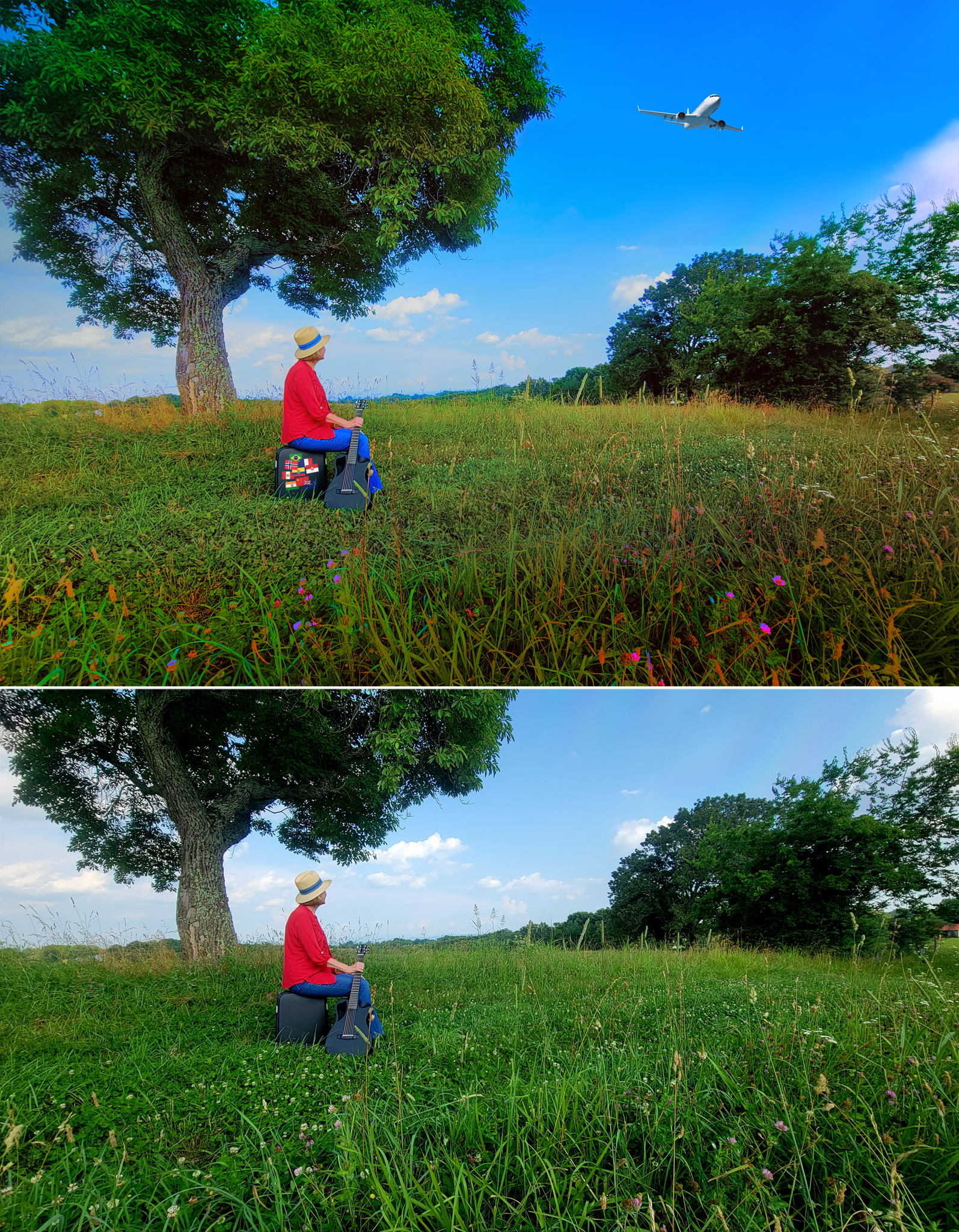
The cover of Arlene Anderson's memoir of her global adventures (“and misadventures”) utilizes original photos of the author in a field, looking up at the flightpath of an airplane.
| |
 |
| |
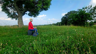
Click for original photo of Arlene Anderson by Will Kruger, before being retouched. |
| |
|
The photos are by her friend and fellow musician Will Kruger. I retouched the images to exaggerate the colors of the flowers and grasses. And, perhaps to no one's surprise, the plane she is looking up at was added in later. Travel stickers were also added to her suitcase to make it more evident that it is a suitcase. The top of the tree was rebuilt using outtakes from the same photo session because it was not in the original frame.
The back cover, of Anderson standing with guitar in hand, is assembled from the same session - edited to merge the best image of her with the best image of the field.
| |
 |
| |
Click for hi-res promotional image of the cover art sans text. |
| |
|
The book is 8¼"x8¼" square instead of the usual 6"x9" rectangle. That was the author's decision, and I hope that having the book's shape and size similar to a record album will make it more tempting to folks who see it alongside her albums at her merch table at gigs.
A rectangular version of the cover was also made for the ebook edition, and alternate versions of the cover art were produced for promotional use. |
| Client: |
Arlene Anderson (2022) |
| Art Direction: |
Arelene Anderson, Will Bueché, Will Kruger, and Steve Donoso |
| Elements: |
Original photos
©2022 Will Kruger
“passenger jet airplane”
©2011 iStock/Spooh
(national flags)
Public domain |
| Fonts: |
Dreaming, Goudy Old Style, Palatino
|
| |

|
 |
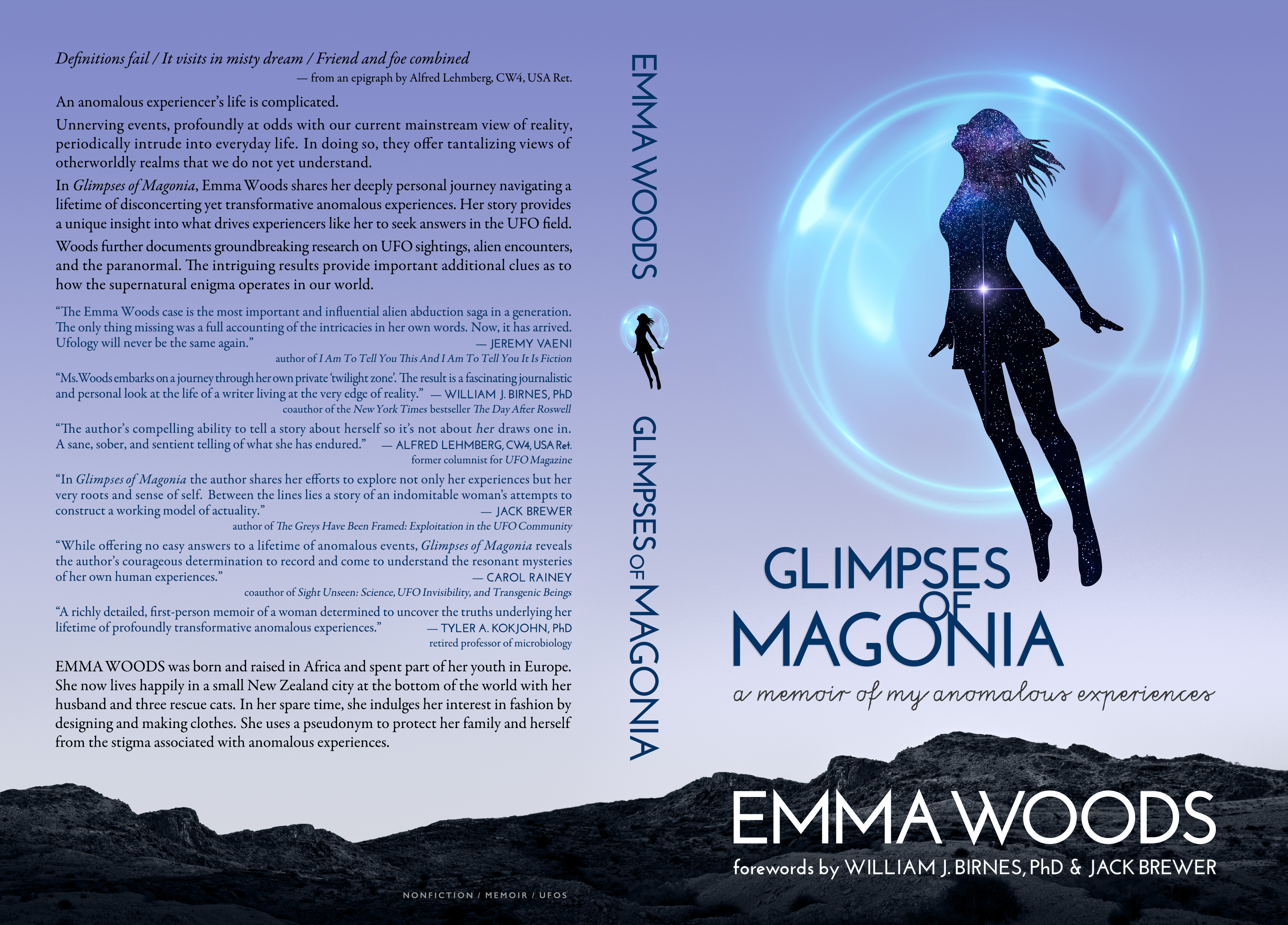
| Glimpses of Magonia |
Emma Woods' memoir covers more ground than her alien encounters, but that is an important part of her story. So I wanted the cover to evoke alien encounters as well as more ethereal possibilities, to entice a broader range of readers.
The author presented a mock-up featuring a silhouette with some stars inside, and a circle. I scoured iStock for similar elements and quickly determined I wanted the figure to be flying. But above what?
| |
 |
| |
The author's mock-up had many of the design elements that made their way into the final cover. |
| |
|
I selected a landscape that resembled the rocky alien worlds which were traditional in “retro” sci-fi artwork of the 1950s/1960s. (The photographer recognized that sci-fi quality as well, labeling the photos “strange rocky planet”.)
The question of whether the figure is floating above a barren part of Earth or another world is up the reader, but the implication of the stars within the silhouette is that she could flit to anywhere in the universe.
As per my usual preferences I reduced the colors to the essentials – turning the landscape nearly black & white, with an early morning twilight cast to the sky. Arguably the figure should be within the blue orb, not in front of it, but that didn't look as striking – so art won out over logic.
The volume of endorsements the book received in advance of its publication made the back cover text layout challenging. By using a different color for the endorsements, I was able to pack them closely against the synopsis and author biography. On the front, the use of a handwritten font for the subtitle adds a human touch, and I stacked the words of the title together to emphasize the circles.
Alternate versions of the cover art, without text and with the figure repositioned, were produced for use on the author's website and social media accounts, as well as for backgrounds of promotional videos. |
| Client: |
Emma Woods (2022) |
| Art Direction: |
Will Bueché |
| Elements: |
“jumping woman”
©2019 iStock/mrsopossum
“Abstract blue light energy sphere”
©2021 iStock/d1sk
“(stars)”
©2015 iStock/Nick_Pandevonium
“strange rocky red planet”
©2018 iStock/RMDobson
|
 |
| Sacred Encounters (2020 revised edition) |
Revisiting one of my earliest book covers for a new edition was a most welcomed opportunity.
For the original cover, 13 years earlier, I'd been provided with a CGI rendering of a woman's head covered by Sanskrit text. The sanskrit was a good concept but the head looked wonky.
We decided to recreate the original cover in a more photorealistic manner.
I was able to remap the Sanskrit text from the original cover onto a new photograph (from iStock) of a woman holding her head and neck in a nearly identical pose. The author expressed the wish for the face to point in the opposite direction, which meant the Sanskrit would also be reversed; we felt this was acceptable since one could interpret the Sanskrit as emanating from within her body rather than being projected onto its surface.
The eyes of the woman in the new photograph were closed, but fortunately in another image from the same photo session her eyes were open, so I was able to transpose the open eye. I reduced the length of her eyelashes to be more natural and less fashion-esque.
To place the woman in a realistic environment I added a forest background and shifted it slightly out of focus. I also reshaped a couple of the trees which had distracting branches.
My penchant for unusual eye colors continued in this cover, with a pink hue that could be thought of as reflecting the pink dawn sky, but could also indicate that this is a magical, surreal moment. In the nighttime light, one may not even notice that the photograph of the woman was black & white – the slight hues on the skin are all added.
The back cover synopsis layout and the choice of cover fonts are in keeping with my design for the author's previous book (see The Dark Face of Heaven, below) and the books of her colleague (see below).
|
| Client: |
Janet Colli, Ph.D. (2018) |
| Art Direction: |
Will Bueché |
| Elements: |
“sleeping woman profile” and
“pensive female profile” (replacing the closed eye with an open eye)
©2015 iStock/lekcej
“Milky Way” (treeline)
©2013 iStock/Surachet Meewaew
|
 |
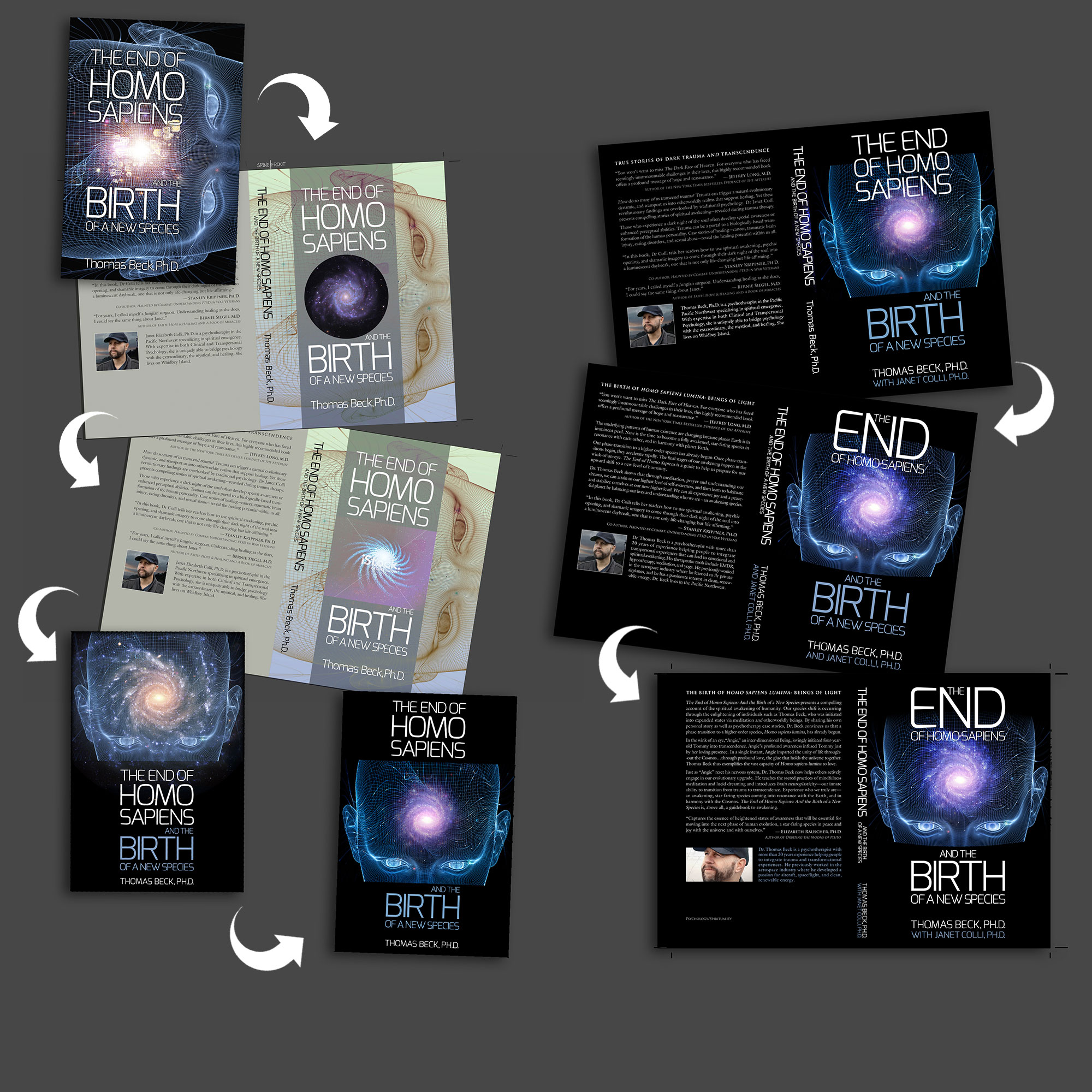
The End of Homo Sapiens
and the Birth of a New Species |
The cover of The End of Homo Sapiens is similar to the one I did for The Dark Face of Heaven; Beck liked what he'd seen on Colli's cover.
The author and I selected an image of a wireframe head (by Andrew Ostrovsky, iStock's agsandrew) that was close to what the author wanted. But where it originally had a series of numbers spiraling out of the forehead, we substituted galaxy NGC 1232 (photographed by the European Southern Observatory), blending it into Ostrovsky's original as seamlessly as possible.
The head ended at the cheekbones (it also did not include the top of the skull), so I put a curved black edge along the cheeks (subtly suggesting a veil being lifted away from the face) and faded the top. The eyes went through several iterations; click to see the changes the eyes went through. You can see how the cover evolved by clicking here.
I selected a font that reminded me of an Arthur C. Clarke book cover, and to deal with the epic-length title (12 words!) a couple of the key words were emphasized. The titles and credits were lined up into a strong vertical rectangle to compensate for the face being only a horizontal slit.
|
| Client: |
Thomas Beck, Ph.D. (2015) |
| Art Direction: |
Will Bueché |
| Elements: |
“Toward Digital thought” (face)
©2014 iStock.com/agsandrew
“Spiral galaxy NGC 1232”
©1998 European Space Agency (ESO)
Author Photo
©2014 Joseph
|
 |
| The Dark Face of Heaven |
The art direction concept for The Dark Face of Heaven arose from hearing the title and reading the synopsis.
| |
 |
| |
The second head was repurposed as shoulders |
| |
|
The fractured statue image was selected from iStock and extended to include shoulders by fusing it with a related image by the same artist.
A red third eye and smoke effects were added. I selected red (or violet) for the third eye in an effort to evoke the concept of trauma, and to subvert the expectation that holy light would be blue.
Includes title exterior title/text elements. The title on the spine illuminates the word “Dark”, again to subvert expectations. Barcode added later by publisher. A wide version of the cover was also prepared for a possible audiobook.
|
| Client: |
Janet Colli, Ph.D. (2014) |
| Art Direction: |
Will Bueché |
| Elements: |
“Shattered Head” (head) and
“Shattered Mind#2”
(repurposed as shoulders)
©2008 iStock.com/morkeman
“Sparkly Purple Background”
(used as third eye)
©2012 iStock/Vaara
|
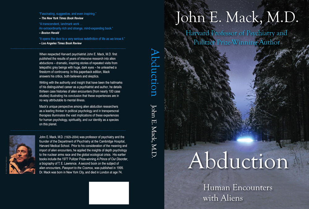 |
| Abduction: Human Encounters with Aliens |
|
This cover was created for the 2014 edition of Abduction, which marked the return of the author's preferred, revised version of the book across all formats - electronic and physical. (See this press release for more of an explanation of why there were different versions of this book.)
This new cover is used on the 2014 Kindle and iTunes editions, but not the physical edition (even though the physical edition's interior pages were updated at the same time.)
The new cover is meant to match the style of Mack's second book on the subject, Passport to the Cosmos (designed by Kam Wai Yu), to make it evident that they go together (despite being from different publishers!).
An iStock image was selected that evokes winter, just as the cover of the sequel evokes spring or summer. Both covers have the same fonts and a similar horizon line. See side-by-side comparison.
The cover image of a winter forest was left almost untouched, with only the addition of stars (or snowflakes) into the crevice of sky, lengthening the road, and color adjustments.
For added consistency with the winter theme, the author portrait on the back cover features Dr. Mack in a winter coat – a Polaroid outtake from a magazine shoot which had long been pinned to a bulletin board in the author's office.
Why is the subtitle so far down? The space under the word "Abduction" was meant to say "Revised Edition" (in blue), but the publisher deleted that and then failed to shift the subtitle upwards. |
| Client: |
John E. Mack Archives LLC
for Simon & Schuster (2014) |
| Art Direction: |
Will Bueché |
| Elements: |
“Winter night scene”
©2006 iStock.com / Dreef (Dainis Derics)
Author Photo
©1994 Richard Mitchell |
| Note: |
Used for the Kindle and iTunes ebook editions released in 2014.
For the physical edition the publisher retained the much-criticised original 1994 cover art (of a hand bathed in blue light) against the wishes of the author's estate. That version now incorrectly shows my name as the cover artist. |
 |
| Web of Souls |
For Michael Cohen's book about “how technology and spirituality are converging” I superimposed the traditional spiritual symbol known as “The Seed of Life” (see Wikipedia) onto a stock image of a synthetic hand reaching out to a human hand. Retro-futuristic fonts reinforce the theme.
|
| Client: |
Michael H. Cohen (2010) |
| Art Direction: |
Will Bueché |
| Elements: |
“Contact”
©2007 iStock.com/joruba
“Seed of Life” symbol
(public domain) |
| Note: |
(not published?) |
 |
| A
Friend of All Faiths |
Directed by the author to use a particular photo of himself which was taken on an island that features in the story, I set about evoking the sense of a memento and a diary by making the photo appear to be a print resting on ruled writing paper with a handwritten-like font for the subtitle. Hints of the beach wrap around both sides. I tried to reduce the size of the billowy clothing; in retrospect I should have reduced it more.
|
| Client: |
Michael H. Cohen (2007 edition) |
| Art Direction: |
Will Bueché |
| Elements: |
Photo provided by author
|
 |
| BACK FLAP |
BACK COVER |
SPINE |
FRONT COVER |
FRONT FLAP |
Sorry about the small image size - because I was not involved in the production of the final sleeve (the addition of titles and synopsis etc.) I do not have a larger image. |
Sacred Encounters |
| Client: |
Janet Colli, Ph.D. (2007) |
| Art Direction: |
Janet Colli, Ph.D. and Will Bueché and Xlibris |
| Elements: |
“head-with-Sanskrit-script” provided by author |
| Notes: |
The author provided the “head-with-Sanskrit-script” image, to which I added lightning and selected the Buddhist color scheme (the deep maroon and yellow). Publisher added the titles and text. I am not responsible for the horrible “cut out” appearance of the author portrait on the back cover.
|
 |
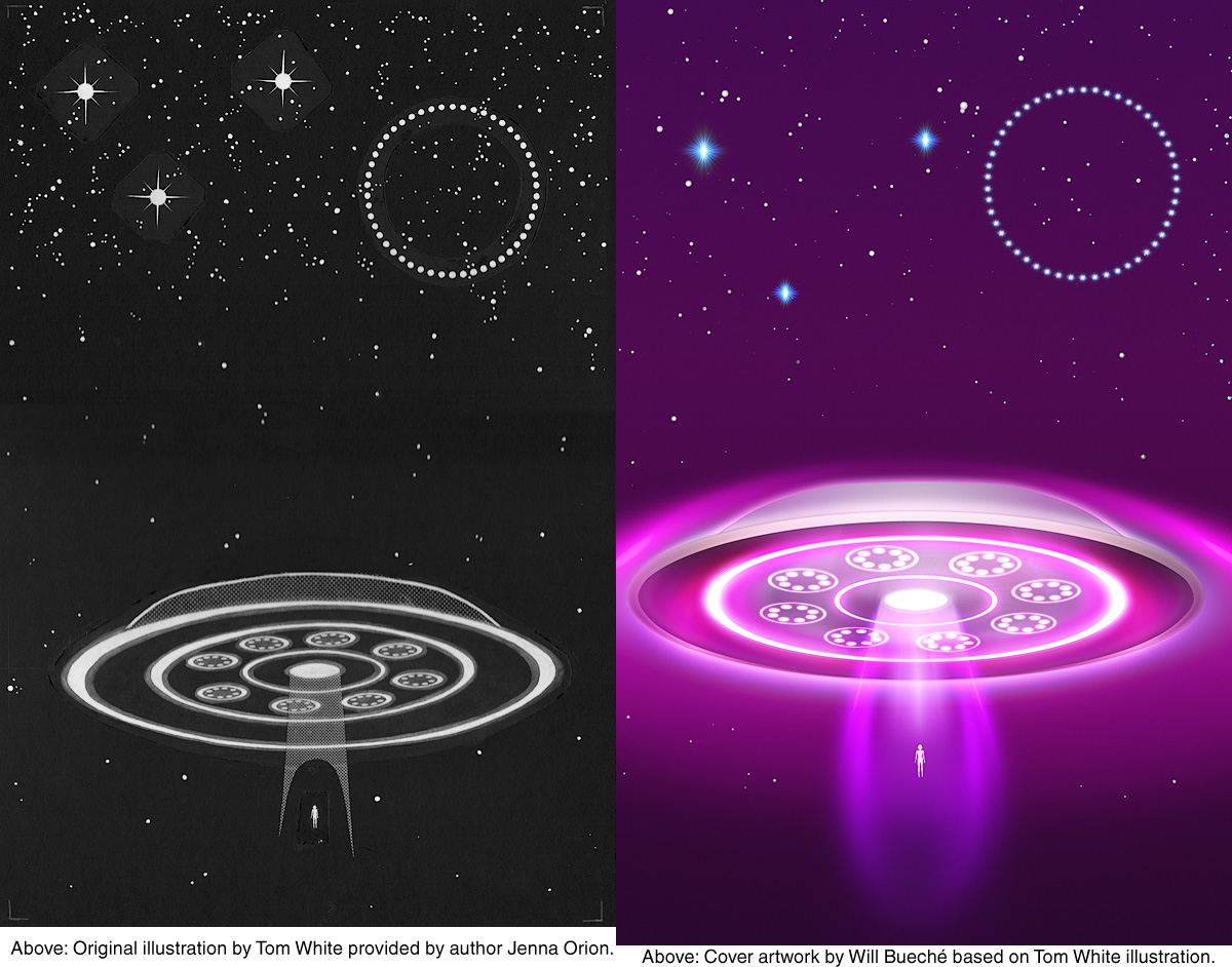
| SKETCH PROVIDED BY AUTHOR |
MY COVER ART BASED ON AUTHOR'S SKETCH |
|
The Legend of 'The Nine' |
| Client: |
Jenna Orion (2000) |
| Notes: |
The author provided a black & white illustration (above left) and asked me to remake it into a more colorful image while retaining every exact detail of the original. (The rest of the cover, including the title, was added later by the publisher.) |
| Elements: |
Black & white illustration provided by author |
| |
|
Related
| Passport to the Cosmos: Commemorative Edition |
In 2008 I was honored to have the opportunity to contribute to the publication of a commemorative edition of Passport to the Cosmos by the late Dr. John Mack, who I worked for from 1999 until the time of his death in 2004.
The cover art was designed by Kam Wai Yu.
The interior was enhanced with illustrations, photos, and new content. My work on the project included soliciting artwork from Dr. Mack's clients for use on the interior pages, and scanning and cleaning the artwork and rendering it into greyscale.
To select the best quotes to accompany the drawings, I not only drew from the book itself but also from the source interviews that had been used by Dr. Mack in his writing of the manuscript, with an ear towards finding the kind of quotes that most engaged Dr. Mack's interest.
I also studied the reviews the book had received when it was originally published in 1999, extracting the best lines for use as critical raves on the back cover.
Additionally, I contacted Budd Hopkins (a colleague of Dr. Mack's) for a new endorsement that acknowledged Dr. Mack's passing, to reinforce the fact that this was a commemorative edition.
And lastly, I was entrusted with the unenviable task of proofreading.
(I would like to acknowledge my partner in this project who prefers not to be named but whose efforts complemented my own.) |
| Client: |
Kunati Press (2008) |
| Art Direction: |
Kam Wai Yu |
| Note: |
The Kunati Press edition (2008) also appears as the White Crow Books edition (2011). |
| |
|
|
|
|
|


